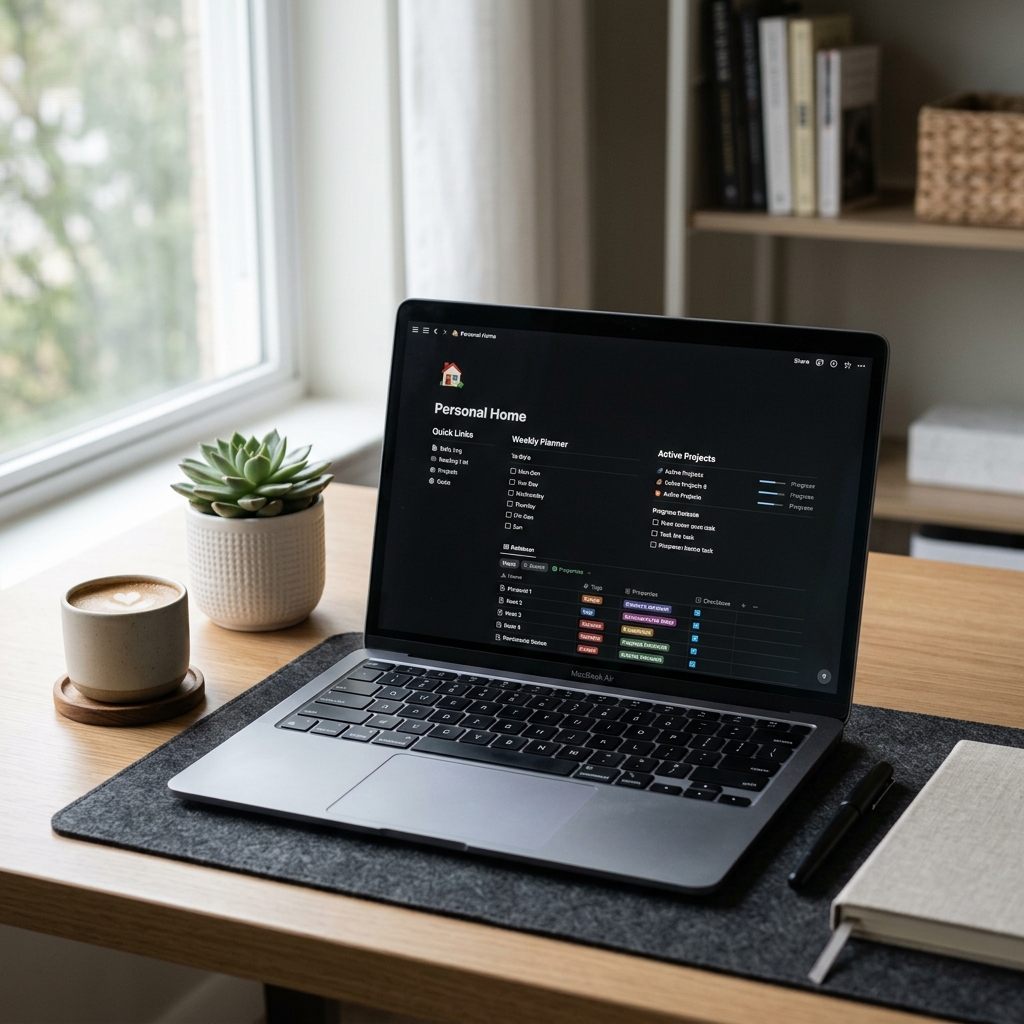
Notion has quietly become one of the most powerful tools on the internet. People use it to run entire businesses, manage content calendars, build team wikis, track client work, and sell premium productivity templates. It is a genuinely remarkable piece of software, and its flexibility is exactly what makes it so popular.
That same flexibility is also what makes it so hard to record.
If you have ever tried to create a Notion walkthrough video, you probably noticed the problem within the first few minutes of watching your footage back. What looked clean and organized on your monitor looks cramped, text-heavy, and often completely unreadable when compressed into a standard video file. The viewer cannot tell what you clicked. They cannot read the database fields you are explaining. They get lost the moment you scroll down a long page.
This is not a content problem. It is a visual communication problem. And solving it requires understanding what makes Notion uniquely difficult to record—and then choosing tools and techniques specifically designed to handle those challenges.
Why Notion Is Harder to Record Than Other Apps
Most screen recording guides assume you are recording something with big buttons and obvious UI. A simple form. A dashboard with large cards. Those are easy. Notion is different.
Notion pages are dense by design. The entire point of the tool is that you can pack enormous amounts of information into a single view—linked databases, toggle lists, gallery views, synced blocks, inline formulas, and filtered table properties all living on the same page. That density is what makes Notion powerful for the person using it. For a viewer watching a recording of it, that density is overwhelming.
Here is what happens physiologically when a viewer watches a wide Notion recording on their phone: their eyes have no natural resting point. There is text everywhere. Nothing is emphasized. Everything competes for attention simultaneously. Within about thirty seconds, the brain starts to disengage because the cognitive load of parsing that much visual information without guidance is too high.
Add a fast-moving mouse cursor darting around the screen—which is how most people naturally navigate Notion—and you now have both visual overload and motion anxiety working against you at the same time.
This is why so many Notion creators get comments like "I couldn't follow along" or "the text was too small" even when their underlying explanation was perfectly clear.
The Three Visual Problems Every Notion Recording Has
Before discussing solutions, it helps to name the problems specifically, because each one requires a different fix.
The Readability Collapse
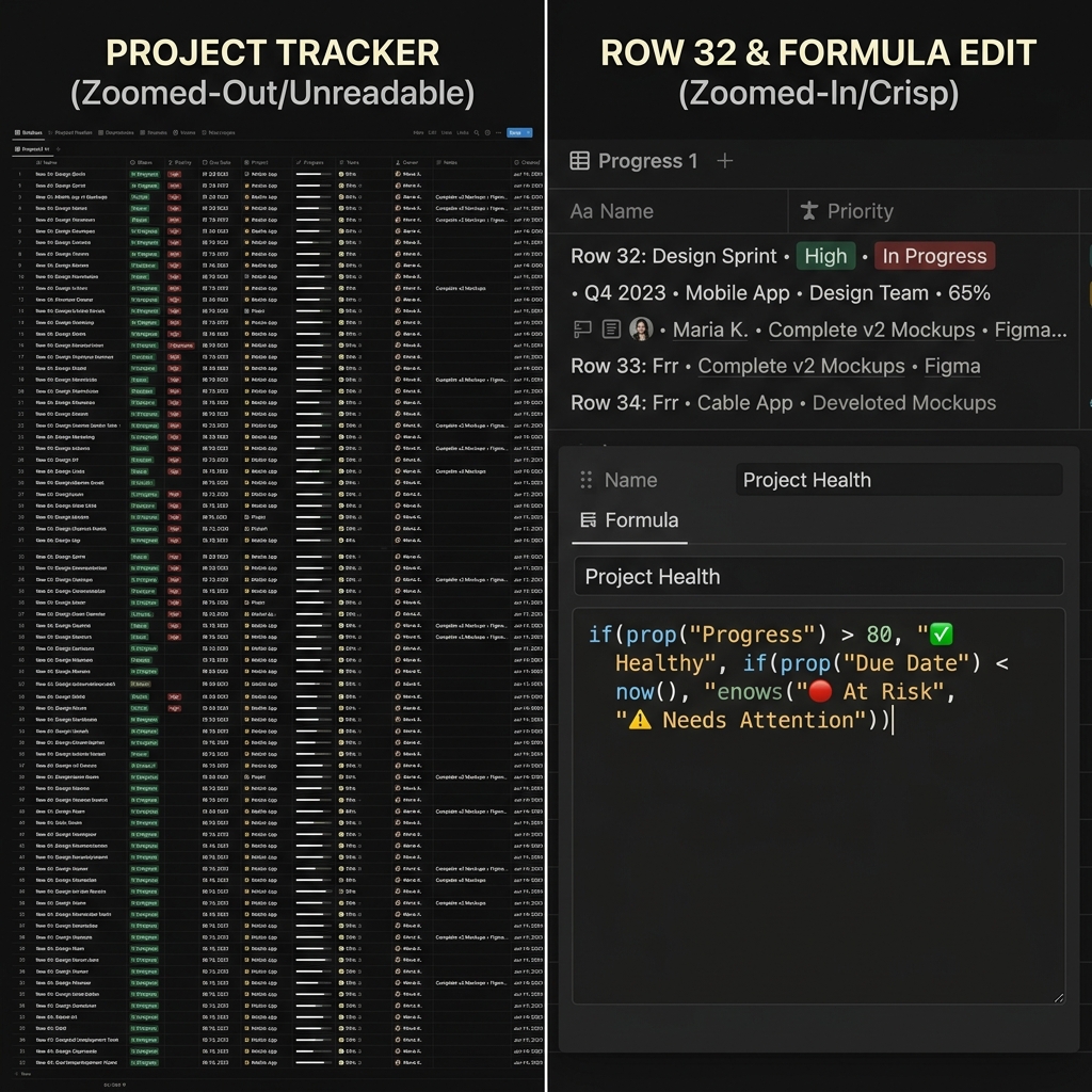
Notion's interface is built for a large monitor with plenty of screen real estate. Database columns are narrow. Property labels are small. Inline text in toggle blocks is sized for comfortable desktop reading, not for video compression.
When you record your full screen and that recording gets compressed into an MP4, then watched on a phone at 60% brightness, all of that detail disappears. What your viewer sees is a wall of gray text with no clear visual hierarchy. This is the readability collapse, and it happens to virtually every Notion recording that uses standard full-screen capture.
The only real fix is zoom. Not aggressive, jarring zoom—but smooth, contextual zoom that follows your active area and pulls the relevant content forward while pushing the rest of the page back. This is what auto-zoom screen recording technology does, and it is the single highest-impact change you can make to a Notion recording.
The Cursor Chaos Problem
Notion has a lot of surface area. When you are explaining a workflow that spans multiple sections—say, a project tracker where you click a task, then navigate to a linked database, then filter a view, then open a property—your cursor covers a lot of ground.
On your monitor, this feels natural. You know exactly where you are going. But on video, your viewer does not have that mental map. They are following your cursor as their only guide to where the action is happening. If that cursor moves fast, jitters slightly, or makes unexpected directional changes, the viewer loses the thread.
Human hands are not precision instruments during casual navigation. We wobble. We overshoot. We circle a target before clicking it. On a tutorial video, that becomes a significant source of visual noise that makes even straightforward workflows feel complicated and rushed.
The Environmental Leakage Issue
Notion runs in a browser. This means your recording almost always captures more than just Notion: the URL bar at the top, your bookmarks strip, your other open tabs, notifications from other tools, and whatever desktop background is lurking behind the browser.
This environmental noise is more damaging than it might seem. Notion's brand identity is deeply tied to minimalism and calm. The entire product aesthetic communicates that organized, intentional work looks clean and peaceful. When your recording is framed by a cluttered browser tab bar and half-visible system notifications, that aesthetic promise is broken before you have said a single word.
What a Professional Notion Walkthrough Actually Looks Like
To understand what you are aiming for, it helps to watch the Notion walkthroughs that perform well—the ones with tens of thousands of views, strong comment engagement, and high template sales conversion.
They share a consistent set of visual characteristics. The camera does not stay static. It moves fluidly with the presenter's actions, zooming in when a specific block or database needs attention, pulling back when context is needed, then zooming in again at the next action point. The cursor moves smoothly and deliberately, as if being operated by someone who knows exactly where they are going. The browser chrome is either invisible or replaced by a clean, neutral background that does not compete with the Notion interface.
The result is a presentation that feels like watching a skilled teacher rather than watching someone use their own computer. That distinction—teacher versus user—is the core difference between a Notion walkthrough that converts viewers and one that loses them.
How Auto-Zoom Changes the Notion Recording Experience
Auto-zoom is the most impactful tool available for Notion tutorials, and it is worth understanding exactly what it does before applying it.
When recording software with auto-zoom capability is active, it tracks where you click and interact with the screen. As you move through a Notion page—opening a toggle, clicking into a database cell, typing a formula, selecting a filter—the recording frame follows those actions. It zooms in to the area you are working in, keeps it centered and readable, then smoothly pans or zooms back out when you move to a different section.
For Notion specifically, this solves the readability collapse problem almost entirely. When you click a specific database property, your viewer sees that property fill most of the frame rather than seeing it as one tiny item in a sea of columns. When you type into a text block, they can read every word. When you expand a toggle, the content inside it is presented at a size that actually makes sense on a phone screen.
The psychological effect is significant. Research on viewer retention and zoom consistently shows that viewers stay with instructional content longer when they are given clear visual guidance about where to focus. Auto-zoom functions as that guidance system, doing automatically what a skilled cameraperson would do in a live production setting.
If you are adding auto-zoom in post-production—which is the traditional approach—you need to go back through your recording and manually add keyframes for every zoom event. For a ten-minute Notion walkthrough with thirty or forty distinct interaction points, this is several hours of editing work. The alternative is to use a screen recorder that applies zoom during capture, which means you finish recording and the zoom is already built into the footage. For teams and creators who publish Notion content regularly, adding auto-zoom without manual editing is the difference between a sustainable workflow and an unsustainable one.
Why Cursor Smoothing Matters Especially in Notion
Cursor smoothing—the process of algorithmically removing the micro-jitter from natural mouse movement—has a larger impact in Notion tutorials than in almost any other recording context, and the reason comes down to the density of Notion's interface.
In a recording of a simple app, a slightly shaky cursor is mildly distracting. In a recording of Notion, where the cursor is constantly the viewer's primary guide through a complex information architecture, that shakiness becomes actively confusing. The viewer's eye follows the cursor. If the cursor moves unpredictably, the viewer's attention moves unpredictably. They are spending cognitive energy tracking the cursor rather than understanding the content.
Smooth cursor motion also reinforces the calm, organized feeling that Notion users associate with the product. Notion's entire visual identity is about structure and tranquility. A cursor that glides smoothly from the sidebar navigation to a database property to an inline formula reinforces that feeling. A cursor that jumps and jitters undermines it at an instinctual level, even when viewers cannot articulate why the recording felt harder to follow.
This is related to a broader principle in instructional video production: why tutorial videos lose viewers is almost never about the content being unclear, and almost always about the visual presentation creating cognitive friction that accumulates until the viewer gives up.
Recording Notion Templates to Sell: The Higher Stakes
For Notion template creators specifically, recording quality is not just a viewer experience consideration—it is a sales conversion factor.
When someone is considering purchasing a Notion template, they are making a judgment call based almost entirely on the demo video. They are asking: does this workspace actually work the way it looks? Can I see myself using this? Will I be able to understand how to operate it?
A walkthrough video that is hard to follow communicates exactly the opposite of what the seller intends. Instead of demonstrating that the template is organized and easy to use, a confusing recording suggests that the template is complicated and might require a lot of learning to implement.
The correlation between recording quality and template sales conversion is not subtle. Creators who invest in proper recording setups—particularly around zoom and cursor presentation—consistently report higher engagement from the same traffic. The product has not changed. The presentation has.
This is the same dynamic that affects every category of screen-recorded demo, from SaaS product demos that need to convert trial signups to onboarding tutorials that need to reduce support tickets. Visual clarity is not a cosmetic concern. It is a functional one.
The Environmental Setup That Works for Notion
Beyond zoom and cursor control, there is a third element that separates mediocre Notion recordings from great ones: the visual environment in which the recording takes place.
The most effective Notion walkthroughs isolate the Notion window from everything else on screen. There is no browser chrome visible. There are no other tabs. There are no system notifications appearing at the corner of the frame. The Notion workspace appears clean and self-contained, often against a simple gradient or neutral background that frames it without competing with it.
This kind of isolation used to require a significant amount of post-production work: masking the browser, adding a background layer, color-correcting to maintain visual consistency. That workflow is slow and requires real editing competence to do well.
Today, tools that offer live backgrounds during screen recording allow you to stage this environment before you hit record. For Notion walkthroughs specifically, where the aesthetic harmony between the content and the presentation matters deeply to the audience, this is a genuine improvement in both quality and workflow efficiency.
Practical Advice for Different Notion Use Cases
Different Notion walkthroughs have different challenges depending on what you are showing.
Database and table-heavy content is the most challenging to record because columns are narrow and property values are small. The most important thing for database recordings is that your zoom triggers specifically on database interactions—clicking into cells, adjusting filters, sorting columns—rather than staying wide and letting viewers try to read small text from a distance.
Template setup walkthroughs benefit most from a relaxed pace combined with consistent zoom. If you are showing someone how to configure a CRM template or a content calendar from scratch, the viewer needs to see each configuration step clearly. Rushing through setup because you know the template well is the most common mistake in template demo recordings.
Team wiki and knowledge base tours are typically more narrative than interactive. You are scrolling through existing content, opening pages, and demonstrating how information is organized rather than building something in real time. These recordings benefit from deliberate scroll pacing and consistent zooming into page headings and key content areas as you reference them.
Formula and automation tutorials are probably the most demanding of any Notion recording type. Notion formulas involve small text input fields, dropdown property selectors, and occasionally complex nested syntax. Getting this content readable on screen requires aggressive zooming into the formula editor and the properties panel, which means your recording setup needs to handle rapid zoom transitions smoothly without creating visual whiplash.
For teams producing Notion tutorials at any kind of regular cadence, the most effective approach is to standardize the recording setup once—zoom behavior, cursor settings, background style—and then apply that standard consistently across every video. This is what high-output tutorial teams do to maintain quality at scale.
The Broader Principle Behind All of This
Every piece of advice in this article points back to the same underlying principle: your job as a Notion content creator is not just to explain your system. It is to make your system feel accessible.
Notion has a reputation for being powerful but complex. Many people who encounter Notion for the first time feel slightly intimidated by the blank page and the infinite configuration possibilities. A great Notion tutorial does not just teach the mechanics of building a database or configuring a template. It also communicates, through its visual presentation, that this tool is manageable, organized, and approachable.
That communication happens entirely through visual clarity. When your recording is zoomed in, readable, smooth, and cleanly staged, you are telling your viewer: this is not complicated. Look how clearly each step unfolds. Look how easy it is to see what is happening.
That feeling—that sense that the tool is learnable and the creator is guiding you safely through it—is what drives template sales, grows YouTube channels, builds email lists, and turns one-time viewers into loyal followers. It has nothing to do with the sophistication of your Notion setup. It has everything to do with how clearly you present it.
For recording Notion walkthroughs with all of this built in automatically during capture rather than added in post, Cubix Capture is built specifically for this workflow—auto-zoom, cursor smoothing, and clean staging, all without a video editor.
Related reading: