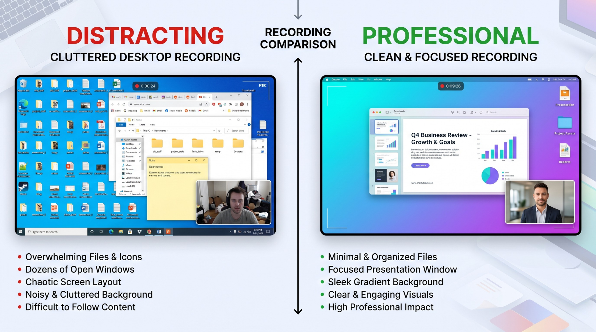
Most people think gradient backgrounds are just a visual trend. In practice, they solve a real instructional problem: they remove clutter and make the active screen area easier to follow.
If your recordings currently show a messy desktop, random notifications, or distracting wallpaper, your audience has to work harder to focus. A clean gradient background immediately improves visual hierarchy and makes your tutorial feel intentional.
This guide walks through how to record your screen with gradient backgrounds on Mac and Windows in a way that is actually useful, repeatable, and fast.
Why Gradient Backgrounds Improve Watchability
Default screen recording captures everything on your monitor, including things your viewer does not need.
Gradient backgrounds help in three ways:
- They remove visual noise.
Your audience focuses on the app window, not your desktop. - They improve readability.
UI panels stand out better against smooth, controlled contrast. - They increase perceived quality.
The video feels designed rather than improvised.
The Traditional Workflow (And Why It Is Slow)
The old process usually looked like this: record raw footage, import into an editor, create a gradient layer, resize and position footage, keyframe movement, and re-export.
For short tutorials, this is overkill. A three-minute recording can easily become an hour of post-production.
A Faster Approach: Apply Backgrounds During Capture
The fastest method is to apply the background while recording, not after.
When your recorder supports live background composition, you can choose a gradient before you hit record and keep the workflow close to one-take publishing.
How to Choose the Right Gradient Style
Not every gradient improves clarity. Good choices are intentional:
- Use low-to-medium saturation so UI text remains dominant.
- Avoid aggressive color shifts that compete with screen content.
- Match tone to purpose:
- cool tones for technical tutorials
- neutral tones for enterprise demos
- vibrant tones for creator content
As a rule: if the viewer notices the background more than the workflow, the gradient is too loud.
Gradient Combinations That Usually Work
If you are unsure where to start, use safe combinations that keep UI readable:
- Dark blue to purple: strong contrast for light UI dashboards
- Soft gray to slate: enterprise demos and neutral brand tone
- Teal to deep navy: modern, tech-forward look for product videos
- Warm orange to magenta: creator and social-first tutorials
Keep one palette per content category so viewers start recognizing your visual identity over time.
Setup Checklist for Mac and Windows
Use this before recording:
- Close unrelated windows and notifications
- Select the exact app/window you want to present
- Pick a gradient with high contrast behind your app edges
- Confirm output resolution (1080p minimum)
- Test one click path to verify text readability
This five-minute setup prevents most re-records.
Mac vs Windows: Practical Setup Differences
The visual goal is identical on both platforms, but setup friction differs:
On Mac
- Make sure recording permissions are enabled in Privacy settings.
- Hide desktop clutter and use Focus mode to reduce notifications.
- Prefer recording a single app window if possible.
On Windows
- Disable taskbar pop-ups before recording.
- Use clean desktop mode or temporary workspace profile.
- Confirm scaling settings so text stays crisp in capture.
Small setup differences like these save retakes and improve final consistency.
Pair Gradient Backgrounds with These Two Elements
A gradient alone helps, but the best results come from combining:
- Auto-zoom: keeps critical UI actions readable
- Smooth cursor behavior: reduces visual anxiety and improves flow
If you skip these, the video can still look pretty but remain hard to follow.
Narration Style That Matches a Premium Visual Look
A polished background with rushed narration creates mismatch. Use a delivery style that fits the visual quality:
- one instruction per sentence
- short pauses after key actions
- outcome language ("you should now see...")
- avoid filler phrases that add cognitive load
When narration and visuals are synchronized, comprehension and retention both improve.
Common Mistakes to Avoid
-
Using high-contrast gradients with tiny text
This can reduce readability, especially on mobile. -
Keeping taskbar or desktop artifacts visible
The whole purpose is to remove noise. -
Over-animating backgrounds
Motion-heavy backgrounds distract from instruction. -
No visual consistency across videos
Use a small background preset library for brand consistency. -
Designing for your monitor, not the viewer's screen
Always test readability on a laptop-sized viewport.
Where This Style Performs Best
Gradient-framed screen recordings are especially strong for:
- SaaS onboarding walkthroughs
- feature announcement videos
- internal training clips
- social tutorials for Reels/Shorts repurposing
- sales follow-up demos where trust matters fast
A Practical No-Edit Workflow
For most teams, this works well:
- Pick one gradient preset by content type
- Record one complete walkthrough in a single pass
- Use live auto-zoom for interaction points
- Export and trim only start/end dead space
This is how you keep speed high without losing production quality.
Post-Publish Optimization Loop
After publishing 3-5 videos in this style, review:
- average watch duration
- drop-off timestamps
- rewatch moments
- click-through to trial/demo pages
Then tune one variable at a time: gradient intensity, zoom behavior, or narration pace. Controlled iteration compounds quality quickly.
Tooling Note
If you want this entire workflow in one place, Cubix Capture supports gradient/live backgrounds on both Mac and Windows and applies auto-zoom plus cursor smoothing during recording.
Final Takeaway
Gradient backgrounds are not just cosmetic. They are a practical way to improve focus, readability, and perceived quality. When paired with clean motion and clear narration, they make screen recordings feel professional immediately.
Related reading: