There is a particular paradox at the center of most recorded presentation advice: the people giving it almost never address the reason recorded presentations fail.
The failure is not content. Teachers, marketers, researchers, and business professionals who record their Google Slides presentations are usually sharing genuinely valuable information. The failure is almost always visual engagement—the experience of watching a static rectangle on screen while a voice talks over it for fifteen minutes.
Static slide recordings are boring not because the presenter is bad at explaining things. They are boring because the human brain is wired to pay attention to movement, and a standard recorded presentation gives it almost none. Understanding exactly why this happens—and what to do about it—is the difference between recording a presentation that people actually watch and one that gets closed after ninety seconds.
What Live Presentations Have That Recorded Ones Don't
When you present a slide deck live in a room, a tremendous amount of communication happens that has nothing to do with the slides themselves.
You point. You gesture. You walk toward the screen when you want to draw attention to a specific element. You pause for emphasis. You make eye contact with different parts of the audience when you want to emphasize a point. Your physical presence creates a kind of kinetic energy that keeps the audience's attention moving with you rather than letting it wander.
When you record a presentation alone at your desk, all of that disappears. The slide is static. Your body language is invisible. The camera does not move because there is no camera—just a frozen rectangle of pixels. The only movement available to you is the cursor, and most people use their cursor in ways that actively hurt rather than help viewer attention.
This is the core problem with recorded presentations: they remove the primary engagement mechanism—your physical presence and movement—without replacing it with anything equivalent.
Why the Cursor Makes Things Worse Instead of Better
Most presenters instinctively try to compensate for the lack of physical movement by using the cursor as a pointer. This is a completely natural impulse. In a live presentation, you would use a laser pointer or your hand. The cursor is the digital equivalent.
The problem is that human hands shake, and that shakiness is amplified enormously on video. When a presenter uses their mouse to circle a data point on a chart or underline a bullet they want to emphasize, the cursor wiggles and jitters visibly. Instead of drawing attention smoothly to the element, it creates a frenetic energy that the viewer's brain reads as nervousness or uncertainty.
There is a second cursor problem specific to slide presentations: the habit of rapid, searching mouse movement. When you are trying to find your next click target during a live recording, your cursor often drifts, reverses, overshoots, and corrects. This kind of searching motion is completely normal and invisible to you in the moment, but on video it reads as a lack of control.
The result is a presentation where the only moving element—the one thing that should be guiding viewer attention—is instead creating visual noise and undermining the authority of the presenter.
The Readability Problem on Small Screens
There is a demographic reality about how recorded presentations are watched that most creators do not account for: a significant portion of your audience is watching on a screen much smaller than yours.
Not just phone screens. Laptop screens at less than full brightness. Tablet screens held at an angle. Browser windows that are not maximized. Zoom calls where the presentation is shared in a tile rather than full-screen.
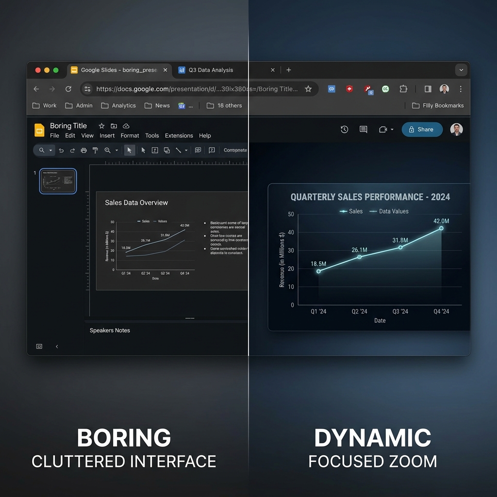
In all of these contexts, information density becomes a critical problem. Google Slides presentations are often built to display beautifully on a 1920×1080 monitor or a conference room projector at full resolution. Charts, tables, graphs, and diagrams that look perfectly readable in that context become illegible at 50% scale.
This is especially acute for data-heavy content. A presenter explaining a chart often says things like "as you can see here" while pointing to a specific data series or axis label. But the viewer on their laptop cannot see it. The label is three pixels tall. The distinction between the blue line and the green line in the chart legend is invisible at that scale.
When viewers cannot see what you are referencing, they cannot follow the explanation. When they cannot follow the explanation, they tune out. And when they tune out, they leave. The data in your presentation never reaches them regardless of how well you explain it verbally.
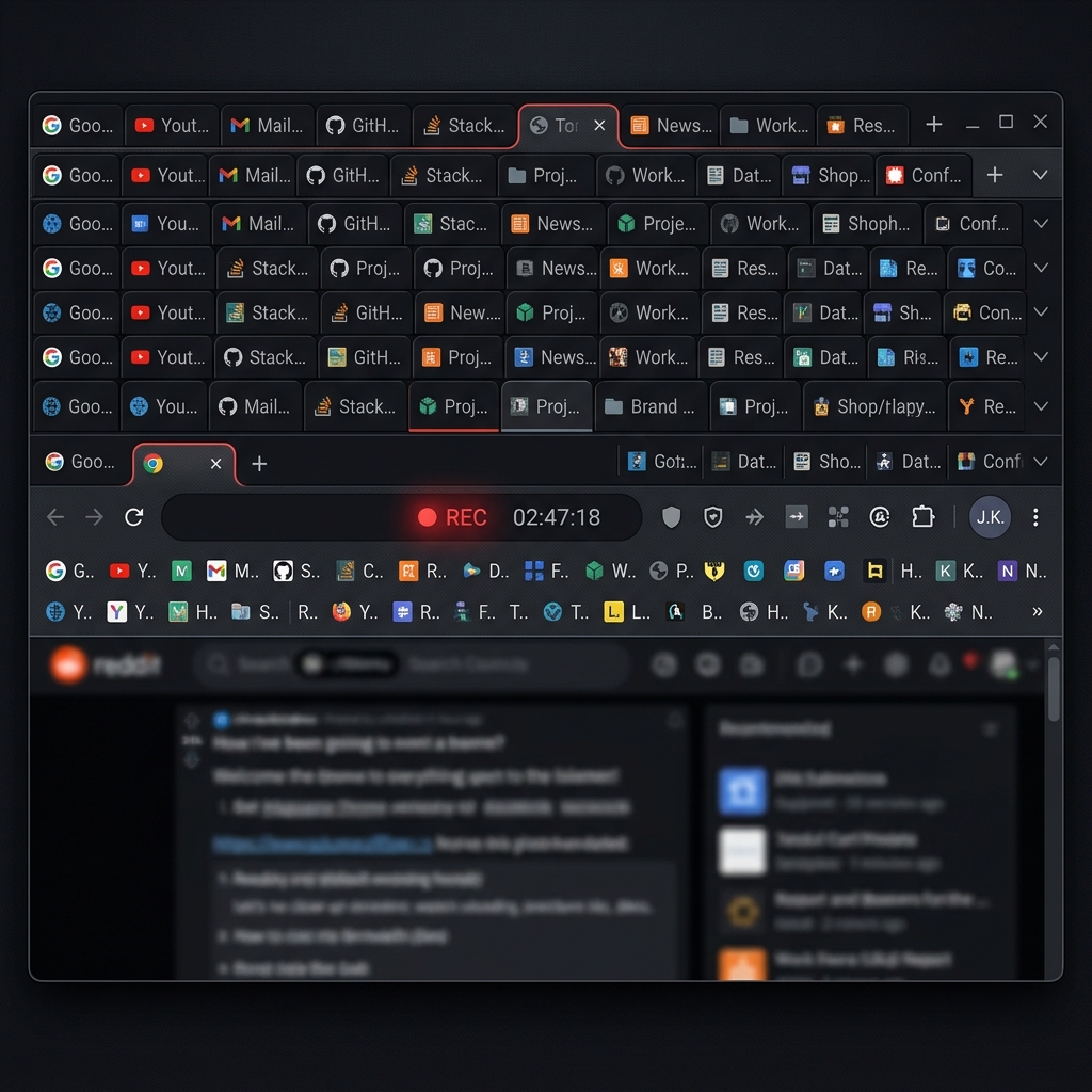
The Browser Chrome Problem
Google Slides runs in a web browser. This is one of its genuine strengths—no software to install, accessible anywhere, collaborative by default. But it creates a specific recording problem that affects almost every presenter who does not take deliberate steps to address it.
When you record your screen while Google Slides is open in a browser, you are recording the browser. The URL bar appears at the top of the frame. The bookmark bar may appear below it, populated with personal bookmarks that have nothing to do with your presentation. Your open tabs are visible at the top—potentially showing your email, your calendar, whatever research you were doing before you hit record.
This browser clutter is not merely aesthetically unpleasant. It actively damages the credibility and professionalism of the presentation. A viewer watching your presentation on enterprise security or financial strategy while your bookmarks bar shows links to Reddit and Netflix is forming a subconscious judgment about your level of preparation and professional care. That judgment is unfair, but it is real.
Beyond personal credibility, the browser chrome reduces the effective screen area devoted to your actual slides. The more of the frame that is occupied by browser interface elements, the smaller and less prominent your presentation content appears.
What Actually Makes a Recorded Presentation Engaging
Understanding why standard recorded presentations fail makes the solution clear. To replace what a live presentation provides—movement, guided attention, spatial orientation—a recorded presentation needs three specific elements working together.
Guided Zoom on Key Content Areas
The most effective thing you can do to improve viewer retention in a recorded presentation is give the frame something to do. When you are explaining a chart, the recording should zoom in on that chart. When you reference a specific bullet point, the frame should move to make that bullet more prominent. When you click to a new slide, the camera should reframe appropriately rather than just cutting to a static new rectangle.
This guided zoom serves the same function as your hand gestures and physical movement in a live presentation: it tells the viewer's eye where to go. Without it, the viewer has to consciously decide where to look, which requires cognitive effort that should be devoted to understanding your content.
The challenge with zoom in recorded presentations has traditionally been that adding it requires post-production. You record the presentation, then you go into a video editor and add zoom keyframe animations for every moment where guidance is needed. For a thirty-minute presentation with fifty or sixty zoom events, this is many hours of editing work.
Tools that apply auto-zoom during capture rather than in post-production eliminate that overhead entirely. The zoom follows your actions in real time, so the recording is already properly edited when you stop. This is the approach that makes regular, high-quality recorded presentations actually sustainable for teachers, marketers, and business professionals who need to produce content frequently.
A Cursor That Guides Rather Than Distracts
The cursor needs to behave differently in a presentation context than it does during everyday computer use. In a presentation, it is a visual pointer. It should move with intention, arrive precisely at its target, and stay still when you are talking rather than drifting and fidgeting.
Cursor smoothing addresses the mechanical part of this: the micro-jitter from natural hand movement is algorithmically removed, making movement paths appear deliberate and smooth. But the behavioral habits—searching movement, unnecessary hovering, rapid corrections—are things that presenters need to think about consciously.
The most effective presentation cursor technique is to move the cursor only when you intend to point to something, and keep it in a neutral, unobtrusive position when you are just talking. This takes practice, but even a basic smooth cursor that removes jitter from otherwise natural movement is a significant improvement over the default.
This connects to broader research on how viewer attention follows cursor motion and why presentations with calm, deliberate cursor behavior consistently outperform those with active, searching cursor movement on viewer retention metrics.
A Clean Visual Environment
The third element is the recording environment itself. A well-staged presentation recording looks as if the slide exists on its own—not inside a browser, not on a computer desktop, but simply as a clean visual object against a neutral or complementary background.
Achieving this look means controlling what appears in the recording frame: hiding the browser chrome, using a clean system background if the desktop is visible, and ideally applying a background behind the presentation window that is neutral and professional. This is the visual equivalent of the dark auditorium in a live presentation—everything that is not the presentation is removed, so the viewer's attention has nowhere to go except the content.
The Different Presentation Types and Their Specific Challenges
Not all Google Slides recordings face the same challenges. The right approach depends significantly on what kind of presentation you are recording.
Educational and course content is perhaps the highest-stakes category, because student engagement directly affects learning outcomes. Students watching recorded lectures often do so passively—they let the video play in the background while their attention drifts. Guided zoom and deliberate cursor pointing are particularly effective in this context because they create micro-moments of visual change that pull wandering attention back to the screen. For course creators, the added difficulty is that recordings need to stay relevant over time without requiring constant re-recording—which means getting the visual quality right from the start rather than planning to fix it later.
Marketing and sales presentations face a different challenge: the viewer's intent is evaluative rather than educational. They are watching to judge whether your product, service, or proposal is worth their further attention. Visual quality signals professionalism and preparation in this context with unusual directness. A marketing presentation that looks polished and intentional communicates that the organization behind it takes quality seriously. This is closely related to what makes SaaS demo recordings convert—the same principles of visual trust apply to presentation recordings.
Conference talks and webinar recordings are watched by an audience that chose to be there—they have self-selected interest in the topic. But that interest does not guarantee sustained attention, particularly in a world where these recordings are watched on-demand, often without the social accountability of a live event. Pacing and visual variety are particularly important for long-format content; a forty-minute webinar recording without visual movement is extremely difficult to watch to completion.
Internal team presentations are often treated as low-stakes, but this is a mistake. Internal presentations shape how colleagues understand strategy, priorities, and decisions. A confusing or hard-to-watch internal presentation means decisions get made without full information. Treating internal recording quality with the same seriousness as external content pays dividends in organizational alignment.
Why Viewer Retention in Recorded Presentations Is Harder Than People Think
Most creators who record presentations check their analytics and are surprised by how quickly viewers drop off. A thirty-minute presentation might lose half its audience by the ten-minute mark. This feels discouraging, and the typical response is to try to improve the content—make it more concise, add more examples, restructure the flow.
But content quality is often not the problem. The problem is the presentation experience itself: long stretches of unchanging screen, a cursor that moves erratically when it moves at all, content that requires squinting to read on mobile, and a visual environment that looks like a raw screen recording rather than a professional presentation.
Understanding why tutorial videos lose viewers reveals that the most common drop-off trigger is not boredom with the subject matter but accumulated cognitive friction—the effort of watching content that is not actively guiding your attention. Each element of visual noise, every unreadable chart, every jittery cursor movement adds a small amount of friction. It accumulates until the viewer decides that watching something else is easier.
Building a Sustainable Recorded Presentation Workflow
For professionals who regularly record Google Slides presentations—teachers, marketers, team leads, researchers—the goal is not just to make one great recording. It is to develop a workflow that reliably produces quality recordings without requiring significant production time for each one.
The most effective approach is to solve the visual quality problem at the recording stage rather than in post-production. If your recording setup handles zoom, cursor smoothing, and environmental staging automatically during capture, then each recording requires only the time to prepare the slides and deliver the presentation. There is no editing queue, no keyframe work, no cleanup pass.
For teams and individuals who currently spend hours post-producing their presentation recordings, switching to a capture-time solution typically saves more time than any other single change to the workflow. Cubix Capture is built specifically for this approach—zoom, cursor smoothing, and clean staging applied automatically while you present, without touching a video editor afterward.
The Gap Between What You Know and What Your Viewer Sees
There is a specific challenge in presenting material you know well: you see the slide differently than your viewer does.
You know that the chart on slide twelve shows a 23% improvement. You see it clearly in your mind even before you look at the screen. When you point to it during recording, you do it quickly, because you know exactly where it is and what it shows.
Your viewer does not have that foreknowledge. They are encountering the chart for the first time. They need a moment to orient, to find the data series you are referring to, to read the axis labels. If your cursor moves to the data point and away before they have had time to find it, they have missed the point entirely.
Guided zoom solves part of this problem by making the chart larger and more readable. But the more fundamental fix is developing the habit of staying on each element for longer than feels natural. What feels like an obvious pause from the presenter's perspective is often barely enough time for a viewer to orient and register what they are seeing.
This is one of the most common pieces of feedback that recorded presentations receive from their audiences: "you moved on too quickly." The presenter experienced the presentation as going at a normal pace. The viewer experienced it as a blur.
Recording and reviewing your own presentations before publishing—even just the first few minutes—quickly reveals these pacing issues. The combination of reviewed pacing and automated visual guidance gets recorded presentations significantly closer to the experience of being in the room.
Related reading: