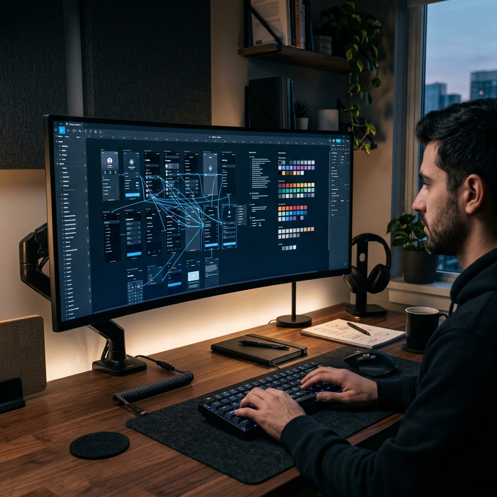
There is a particular frustration that designers know well: you spend days, sometimes weeks, building something that looks genuinely beautiful in Figma. The spacing is meticulous. The typography is considered. The prototype interactions are smooth and intentional. And then you hit record to show it to someone, and the result looks like a disaster.
The cursor is flying everywhere. The layers panel is cluttering the left side of the frame. The design frames themselves look like tiny postage stamps in the middle of an infinite gray canvas. The properties panel text is completely unreadable. And somehow, the thing you spent all that time crafting looks like a rough draft.
This is not a failure of design skill. It is a failure of recording approach. Figma has specific visual characteristics that make it unusually difficult to capture clearly, and most screen recorders are not built to handle them. Understanding those characteristics—and choosing tools that address them directly—is what separates a compelling Figma walkthrough from a confusing one.
Why Figma Is Uniquely Difficult to Record
Figma's power as a design tool comes from features that are genuinely hostile to clear screen recording. The infinite canvas is the most obvious example.
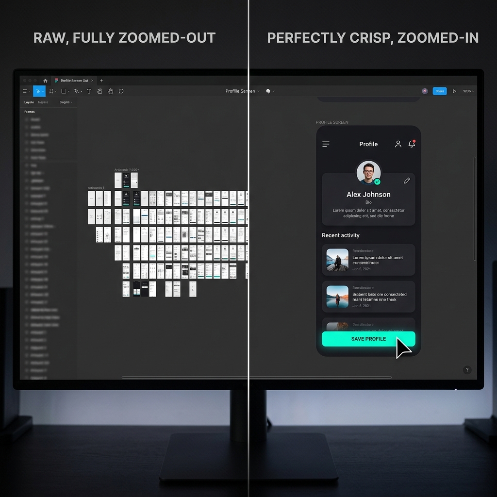
In Figma, you can zoom out to see your entire project at once—fifty screens, multiple user flows, a complete design system, all visible simultaneously. This is extraordinarily useful when you are designing. But when you record from that zoomed-out view, the individual frames that contain your actual work are tiny. A mobile app design that looks stunning at 100% zoom looks like a thumbnail at 30% zoom.
The inverse problem is equally real. When you zoom in to show a specific component or interaction, you lose all context about where that component lives in the broader design. Viewers watching a zoomed-in recording do not know if they are looking at a modal, a tooltip, a mobile screen, or a web layout. They lose their spatial orientation and, with it, their ability to follow what you are explaining.
This is the core tension of recording Figma: you are constantly navigating between the zoomed-out view that provides context and the zoomed-in view that provides clarity, and standard screen recording captures all of that navigation in real time, making the recording feel chaotic even when the design work itself is excellent.
The Layers Panel and Properties Panel Problem
Beyond the canvas navigation issue, Figma has two side panels that create additional recording challenges: the layers panel on the left and the design properties panel on the right.
These panels contain genuinely important information for certain audiences. Developers watching a handoff recording need to see the exact spacing values, color hex codes, typography specifications, and border radii in the properties panel. Stakeholders reviewing a complex flow need to understand the layer structure to follow which elements are interactive.
But both panels are built for desktop use at full resolution, where the text is perfectly readable. In a screen recording, particularly one watched on a laptop or phone, that panel text becomes extremely small. The values that a developer needs—the ones you are explicitly recording to communicate—become illegible.
Most presenters respond to this by zooming into the properties panel manually during recording, but that manual navigation looks awkward on video. It disrupts the flow of the presentation and makes the recording feel like watching someone fumble with their own tool rather than expertly guide a viewer through a finished design.
The Infinite Canvas as Visual Noise
Here is something Figma users do not always consciously register: the gray infinite canvas that surrounds your design frames reads as visual noise on video.
When you are working in Figma, your brain filters out that gray background. It knows to focus on the frames. But a viewer watching your recording does not have that mental context. Their eye is drawn to the entire frame of the recording, and a large proportion of that frame—often fifty percent or more—is just the canvas. This makes your design frames look smaller, the overall recording feel emptier, and the visual hierarchy of the presentation much weaker than it should be.
In a well-produced design presentation, the design itself should fill most of the frame. The surrounding environment should be either minimized or replaced with something that complements the work rather than competing with it.
How Auto-Zoom Solves the Figma Recording Problem
Auto-zoom is the most transformative tool available for Figma screen recordings, and its impact is more significant for designers than for almost any other use case.
Here is what auto-zoom does in practice: it tracks where you click and interact in Figma, and it smoothly moves the recording frame to follow your actions. When you click on a frame to show a prototype interaction, the recording zooms in on that frame. When you click through to a different screen in a prototype flow, the recording follows the transition. When you click a property in the side panel to show a specific value, the recording zooms in so that value is actually readable.
The effect is profound. Instead of watching someone navigate a confusing workspace, the viewer sees a smooth, guided tour of the design. The recording frame always seems to be in exactly the right place at exactly the right time. The work is always clearly visible. The supporting information is always readable when it matters.
This is not something you can fully replicate by zooming within Figma itself during recording, because Figma's own zoom is part of the canvas navigation—it changes what you see in the tool, but it does not intelligently frame the recording. Auto-zoom in screen recording software operates at the screen capture level, intelligently cropping and panning the recording frame in response to your interaction rather than changing your view within the application.
For designers who add zoom in post-production—which has traditionally been the approach—this means going through the recording after the fact and manually adding keyframe animations for every significant interaction. For a Figma walkthrough with twenty or thirty screens, that can mean several hours of work in After Effects or Premiere for a presentation that should take thirty minutes to record. The alternative is capturing with auto-zoom built in, so the recording is presentation-ready when you stop.
The Designer Mouse Problem and Why It Matters
Designers work fast. That is part of the job. Inside Figma, your mouse is constantly moving—grabbing layers, dragging frames, pulling up the constraints panel, flying to the prototype tab, clicking into a nested component, returning to the canvas. The speed and fluidity of that navigation is a professional skill. On video, it reads as chaos.
This is because viewers watching a recording do not have the same mental map of the tool that you do. To them, the cursor is not expressing expertise—it is creating uncertainty. Every fast movement raises the question: where is that going? Every overshoot and correction suggests the software is complicated. Every rapid direction change loses the viewer's eye.
Research on how cursor motion affects viewer retention shows that viewers interpret deliberate, smooth cursor movement as evidence of competence and confidence, while fast, jittery movement increases cognitive load and reduces comprehension. For design presentations specifically—where you are trying to convey professional polish—this is a particularly damaging signal.
The solution is cursor smoothing: algorithmic processing that removes the micro-jitter and natural wobble from mouse movement, translating what you actually do with your hand into a smooth, deliberate-looking path on screen. The result is that prototype walkthroughs that felt rushed and chaotic during recording appear calm, precise, and intentional to the viewer.
This is directly relevant to the impression your clients form about your design process. When they watch a recording where every click lands precisely and every transition follows a smooth arc, they experience your design presentation as authoritative. When they watch a recording where the cursor bounces around and corrects itself, they experience it as uncertain—and that uncertainty can attach itself to their perception of the design itself, not just the recording.
Recording for Different Figma Audiences
The right recording approach depends heavily on who you are making the video for, because different audiences need different information presented in different ways.
Client Presentations and Stakeholder Reviews
Clients watching a design presentation need to understand the user experience, not the technical implementation. They need to see how the design flows from screen to screen, how the prototype interactions work, and how the visual hierarchy guides users through a journey.
For client presentations, the most important recording elements are prototype flow clarity and visual polish. Auto-zoom should follow prototype interactions—button clicks, swipe transitions, modal appearances—so clients see those interactions at a size that makes the design feel real and immediate. The recording environment should be clean and brand-consistent; showing a cluttered Figma workspace with a busy layers panel communicates messiness, even when the design itself is immaculate.
Developer Handoff Recordings
Developers watching a handoff recording have completely different needs. They need to read the actual specifications: exact pixel values, color codes, typography styles, spacing measurements, component names. A recording that looks great in a client presentation may be useless for a developer handoff because the values they need are too small to read.
For developer handoffs, auto-zoom needs to work specifically with the properties panel—zooming in when you click a property value so that number is fully legible. These recordings also benefit from a slower pace than client presentations; developers need time to pause, read, and verify the specifications, which means the presenter needs to stay on each element long enough for those values to register.
Portfolio and Case Study Videos
Portfolio recordings are the most demanding of all because they need to impress people who are evaluating your design skill based entirely on the quality of the presentation. A portfolio recording that looks professionally produced signals that you take your work seriously and pay attention to detail—exactly the qualities a potential client or employer is hoping to find.
For portfolio recordings, every element of visual polish matters. The recording frame should be tight on the work, with no visible canvas clutter. Transitions between screens should be smooth and motivated. The cursor should feel like it belongs to someone who is completely in control. The background environment should complement the color palette of the design rather than clashing with it.
This is where tools that offer live backgrounds and clean staging during recording make an outsized difference. Placing a Figma design against a neutral gradient that harmonizes with its color story makes the work look curated and intentional rather than captured. For portfolio videos specifically, that difference is significant.
The Comparison That Explains Why This Matters
Think about the difference between watching a film where the camera work is excellent versus watching shaky handheld footage of the same scene.
The scene content is identical. The events are the same. But the professional cinematography makes you trust what you are seeing. It signals that someone in control made deliberate choices about what to show you and when. The shaky handheld footage creates uncertainty—you are not sure if you are seeing the right thing, or if the chaos on screen is intentional or accidental.
Screen recordings of Figma work the same way. The underlying design may be exactly the same in both recordings. But the recording with smooth zoom, deliberate cursor movement, and clean staging makes the viewer trust the design. The chaotic recording makes them uncertain.
For designers, this trust transfer is everything. The recording is not documentation of the design—it is the design's first impression on someone who cannot yet see it in person. If that first impression is confusion, your design work starts at a deficit before anyone has even evaluated the actual work.
This connects directly to why screen recordings that look unprofessional undermine their own content—a dynamic that applies across every category of screen recording, but hits especially hard for designers who are specifically trying to convey precision and care.
The Recording Setup That Actually Works
For designers who want to record Figma presentations that match the quality of the work itself, the most efficient path is a screen recorder that handles auto-zoom, cursor smoothing, and visual staging simultaneously during capture.
Cubix Capture is built for exactly this workflow. Auto-zoom follows prototype interactions and component navigations in real time. Cursor smoothing translates natural mouse movement into deliberate, professional-looking motion. Live backgrounds clean up the recording environment without requiring post-production masking.
The practical result is that the recording is largely presentation-ready when you stop. For designers who currently record raw Figma footage and then spend hours in After Effects adding animation and cleanup, this workflow change removes most of that overhead without sacrificing the visual quality that makes the difference in client and portfolio contexts.
The Principle Behind the Practice
Every principle discussed in this article comes back to the same core truth: your design work is already the result of careful, professional decision-making. Your recording of it should reflect that same standard.
When viewers watch a Figma walkthrough that is zoomed in where it matters, smooth where it should feel deliberate, and clean where it needs to be authoritative, they are not consciously noting those qualities. They are simply experiencing the design as coherent and impressive. The recording is invisible because it is doing its job, which is to show the work rather than draw attention to itself.
Getting there does not require becoming a videographer or a motion designer. It requires using recording tools that are built to handle the specific visual complexity that Figma presents—and then recording with the same intention and care you bring to the design work itself.
Related reading: